Engadget has been testing and reviewing consumer tech since 2004. Our stories may include affiliate links; if you buy something through a link, we may earn a commission. Read more about how we evaluate products.
Google Calendar for web gets a much-needed makeover
It now looks more like its mobile counterpart.
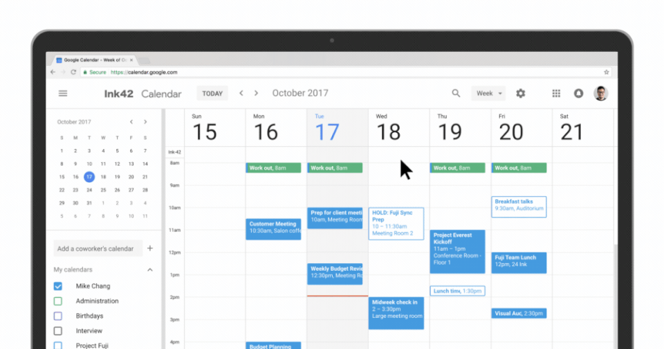


Google Calendar on the web has finally caught up to its sleeker, more visually appealing sibling for mobile. The big G has given the G Suite member a much-needed visual refresh, updating its color palette to look more like the mobile app's and even giving it an interface that automatically adjusts itself to look its best no matter what your screen size is. You can now switch views using a drop-down menu on the top right of the screen and, if you're on Day View mode, it can display several calendars side-by-side.

Google has also infused the redesigned calendar with new features, though they mostly target enterprise users. You can use rich text and hyperlinks in entry descriptions, so you can create bulleted lists and format text to make entries easy to understand. If you use Calendar at work, you might now notice more conference room details, such as how large it is or what kind of equipment it contains, when booking a room. To see these new features, your G Suite admin has to activate the new Calendar first. But if you're just an individual user, check the upper right-hand corner of the interface -- you'll see the "Use the new Calendar" option soon, if you haven't yet.
