Hulu’s website looks different today
Hulu.com receives a streamlined design update.


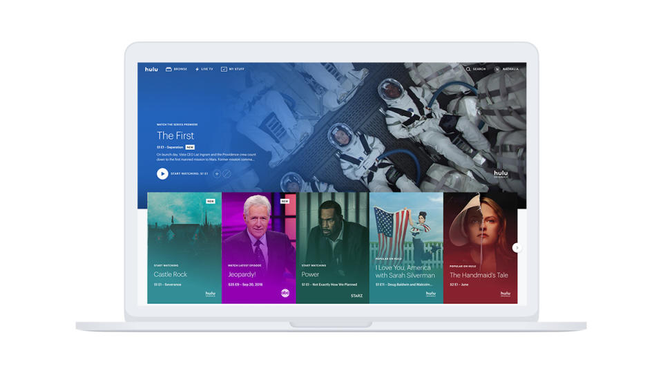

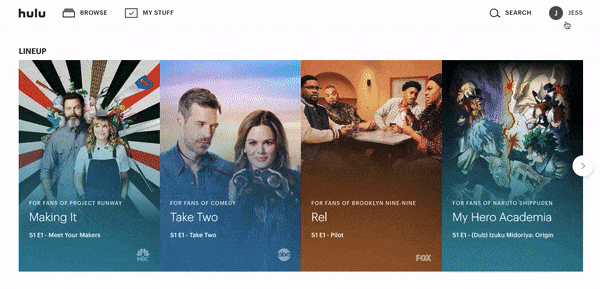
Hulu.com has a fresh face today, following a design update that emphasizes thumbnails and hovering. It's a clean, graphic look, and Hulu has worked to keep the number of clicks to a minimum.
The Watchlist is now bundled into the "My Stuff" tab, and hovering over the thumbnail for a show or movie offers the option to play it, remove it from view or add it to "My Stuff" to check out later. Click on a title and an information card pops up over the homepage, without navigating to a separate link.

Once a video starts playing, buttons along the bottom allow users to skip ahead or backward 10 seconds at a time, and clicking "Up Next" in the bottom right-hand corner plays the following episode in a series.
This design is an evolution of the format the company rolled out a year ago for its Hulu with Live TV subscribers. The web version of Hulu has a handful of exclusive features, including picture-in-picture, Chromecast options, and the ability to watch multiple sports games in multiple windows (for Live TV subscribers).
